
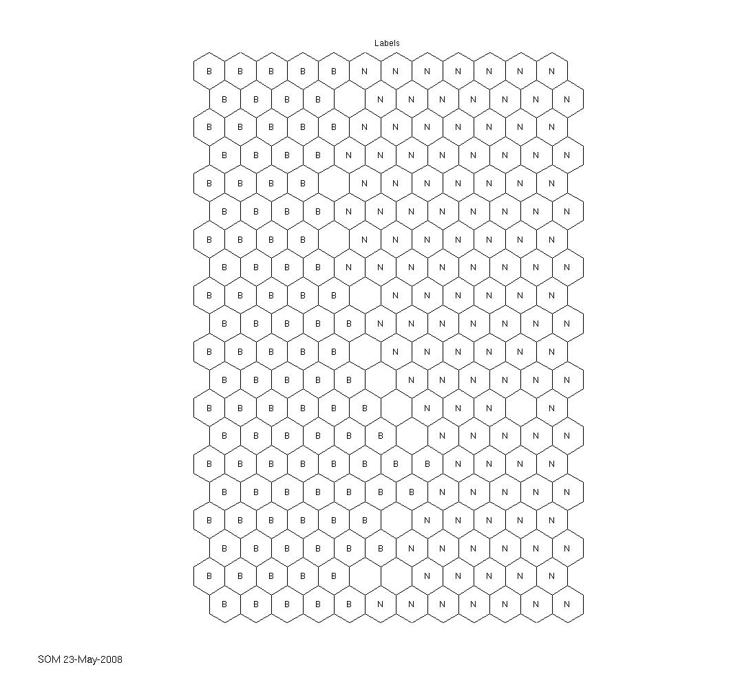
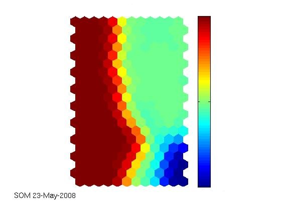
The technical report that I linked to in the latest article is really comprehensive. Together with the supplied iris dataset (that can, of course, also be obtained elsewhere), the SOM toolbox works well and out-of-the-box, as expected. Seems as if the agricultural yield data we have are really interesting and can be visualised appealingly. The first labeled map shows the clustering capability of the SOM. There have been two fertilization strategies on the field where the data come from, simply named „B“ and „N“ here. The second map shows how much fertilizer has been used on the field, from low (blue) to high (red) values. The correlation between the labels and the colored map is obvious. Nevertheless, the ultimate goal still is to try to outperform a neural network in predicting the current year’s yield from sensor data and historical data and, along the way, identify indicators of a field’s heterogeneity.
Nevertheless I was still fiddling around with getting the labels onto the map. It turned out that it was a simple case-sensitivity-error: I had one variable named sM (just as in the tutorial) and in the process the same variable had to be overwritten. However, as I prefer typing the stuff instead of doing copy-and-paste, I misspelled the variable sm which, for Matlab at least, is different from sM, of course. Once I had this figured out, getting a labeled map was really easy and straight-forward.
The code below reads in the specified data set, normalizes it, creates the self-organizing map, creates the labels and shows all the component planes. A map that shows hits and a labeled map are created afterwards.
sD=som_read_data('131_var_all_labels_som.data')

sD=som_normalize(sD,'var');

sM = som_make(sD);

sM=som_autolabel(sM,sD,'vote');

som_show(sM,'comp',1:8,'umat','all','norm','d','subplots',[4 3],'empty','hits','empty','Labels')

som_show_add('label',sM,'subplot',11)

som_show_add('hit',som_hits(sM, sD),'subplot',10)