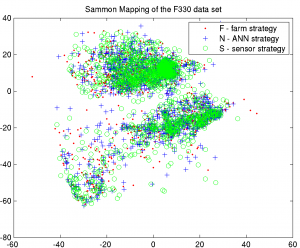
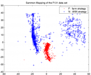
While everyone else is at home, I rode to work and implemented Sammon’s mapping on two of the agriculture data sets. The data set descriptions are in the paper I presented at the SGAI. One of the sets has three farming strategies, the other one just two. I decided to apply the dimensionality reduction of Sammon’s mapping and it turns out that it works quite well for both of the data sets, although the interpretation is much easier for the second one. For starters, here are the plots:
The left plot is somewhat inconclusive: it appears to have three clusters, but it is not clear as to which input parameter these clusters correlate. It can’t be the strategies (F, N, S) though, since each cluster has about the same distribution of farming strategies (from visual inspection). It can’t be the yield either, as can be seen from the following video: mapping-f330 video with yield threshold. As the yield threshold rises, the map is colored more or less evenly.
On the right plot (F131), the farming strategies are clearly separated, with one cluster for the „F“ strategy and two clusters for the „N“ strategy. What’s even more interesting, is the following video: mapping-f131 video with yield threshold. I decided to colour the mapping according to whether the points‘ yield is below or above a certain threshold. I varied the threshold from 0 to 10 and collected the plots into a movie file. It can be seen that the left cluster is a „low yield“ cluster with „N“ strategy, whereas the middle one is „middle yield“ with „F“ strategy and the right one is „high yield“ with „N“ strategy.
Some of the above results and visualization ideas will probably be condensed into a paper for MLDM 2009 in Leipzig. As usual, there’s a matlab script that generated the figures and also gives some hints on the video generation: sammon-experiments-0.m


