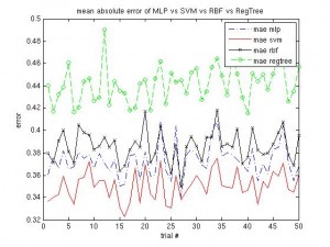
Same procedure as in recent posts … I have four models to be compared, I’ve put them into this script (which runs about an hour on my machine) and the results can be seen below. The simple regression tree is the worst model, but takes almost no time to compute. The RBF takes longest, but the SVM is still better and quicker. I’ll probably run this script on different data, to see how it performs there.
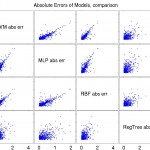
After reading parts of the Handbook of Data Visualization I concluded that I should probably find some more ideas on visualizing the data or the models‘ predictions. For starters, I updated the ‚four-models-comparison‘ script to generate a plotmatrix: simply n x n scatterplots. As I have described above, the regression tree performs worst in the sense that it doesn’t agree too much with the other models or at least yields a higher error.
The updated script can be found savefig script from Matlab Central, which comes in really handy here.
TO-DO: I guess I should change the scales to be the same for comparison reasons.


