
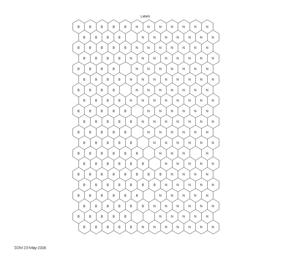
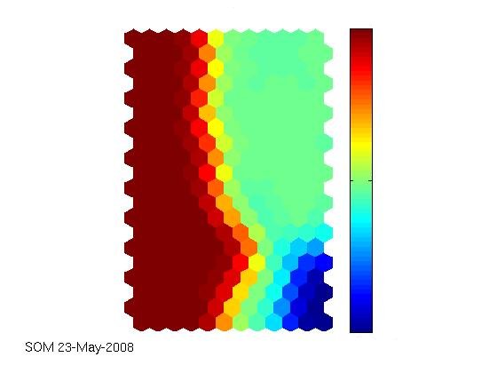
The technical report that I linked to in the latest article is really comprehensive. Together with the supplied iris dataset (that can, of course, also be obtained elsewhere), the SOM toolbox works well and out-of-the-box, as expected. Seems as if the agricultural yield data we have are really interesting and can be visualised appealingly. The first labeled map shows the clustering capability of the SOM. There have been two fertilization strategies on the field where the data come from, simply named „B“ and „N“ here. The second map shows how much fertilizer has been used on the field, from low (blue) to high (red) values. The correlation between the labels and the colored map is obvious. Nevertheless, the ultimate goal still is to try to outperform a neural network in predicting the current year’s yield from sensor data and historical data and, along the way, identify indicators of a field’s heterogeneity.
Read the rest of this entry »